


Crafting Palettes of Distinction at Kuilei Place
June 10th, 2024
Kuilei Place is bringing the joy of choice to its residents. Philpotts Interiors — Hawaiʻi’s premier design firm — has created two distinct color and finish palettes for Kuilei Place residents. Buyers who purchase during the pre-construction phase have the option to choose a kitchen and bathroom that best reflects their personal style. This level of choice is a result of Kobayashi Group’s commitment to offering a joyful and personalized experience during the process of buying a home.
“In the more than 11 developments I’ve been involved with, it’s very rare to see this level of choice,” said Holly Boling Ruiz, partner at Philpotts Interiors. “We’ve designed two exceptional palettes, each warm and welcoming. Both options are phenomenal, offering residents a unique way to personalize their homes.”
Philpotts Interiors’ approach to creating the two distinctive design palettes focused on both aesthetic and emotional appeal. The power of choice is paramount. Studies show that having limited, yet meaningful options enhances happiness and reduces regret. Cognitively, people can’t effectively compare more than five options, which is why Philpotts Interiors carefully curated two thoughtful schemes inspired by Hawai‘i’s natural beauty.
“When you arrive home, you want the layers of stress to leave you. With familiar textures and forms, you’ll naturally start to destress,” explains Holly. “It’s actually biologically proven that when you look out to the sky and nature, it lowers your heart rate and relieves tension. Both color palettes aim to create a space where residents will unconsciously feel comfortable because they’re surrounded by the familiar colors and forms found in our islands.”
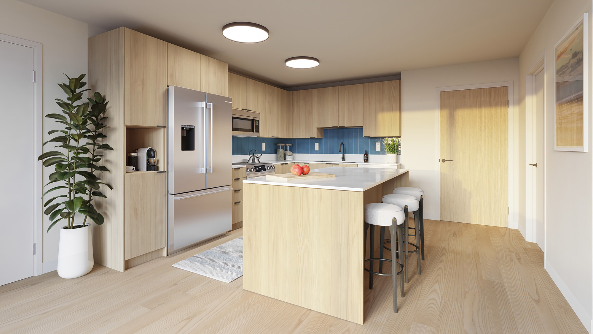
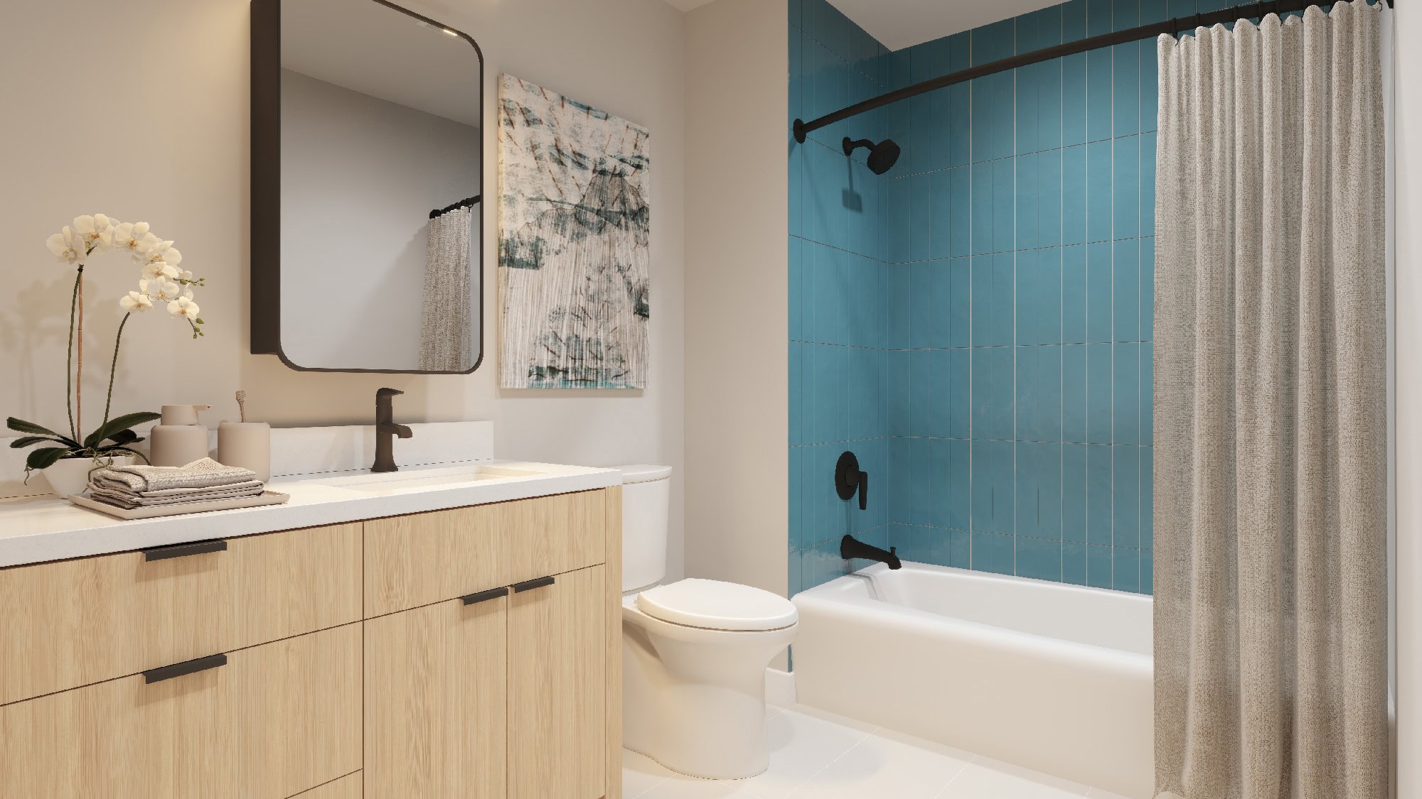
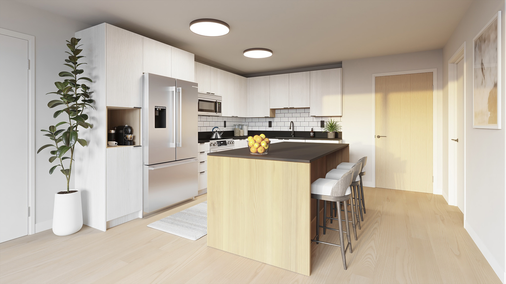
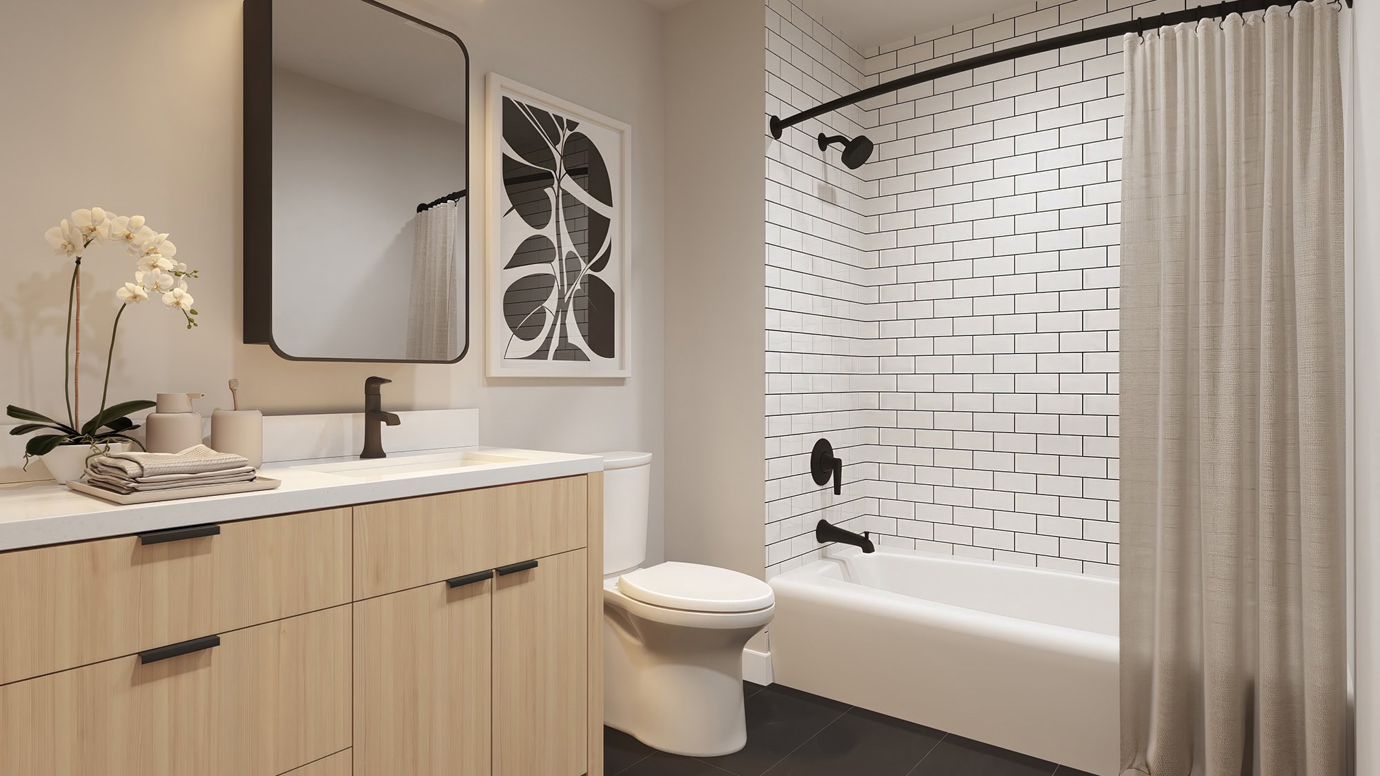
The classic monochrome palette is inspired by warm woods and grey tones reminiscent of aged lava. It’s neutral yet sophisticated, featuring bright white contrasted by deep charcoal gray countertops. According to Holly, classic monochrome is a bold choice but without the risk because of its timeless design. The combination creates a high-contrast environment that feels tailored, intelligent, and evocative of simplicity.
The modern cerulean palette evokes the colors of the sky and ocean, bringing a familiar and calming feel to the home. Holly describes the cerulean as a “colored neutral” mellowed with grey undertones, making spaces feel larger. Historically, because it was a rare paint color, blue was a symbol of status; today, this shade has been modernized for contemporary living. It’s a soothing color scheme associated with trust, wisdom, comfort, and peace.
With either choice, residents at Kuilei Place will experience a sense of joy and satisfaction, knowing they have made a selection that reflect their personal taste. Philpotts Interiors designed both palettes of distinction to resonate with homeowners for years to come.